Centraal Beheer
Case
Visual Identity
Design System
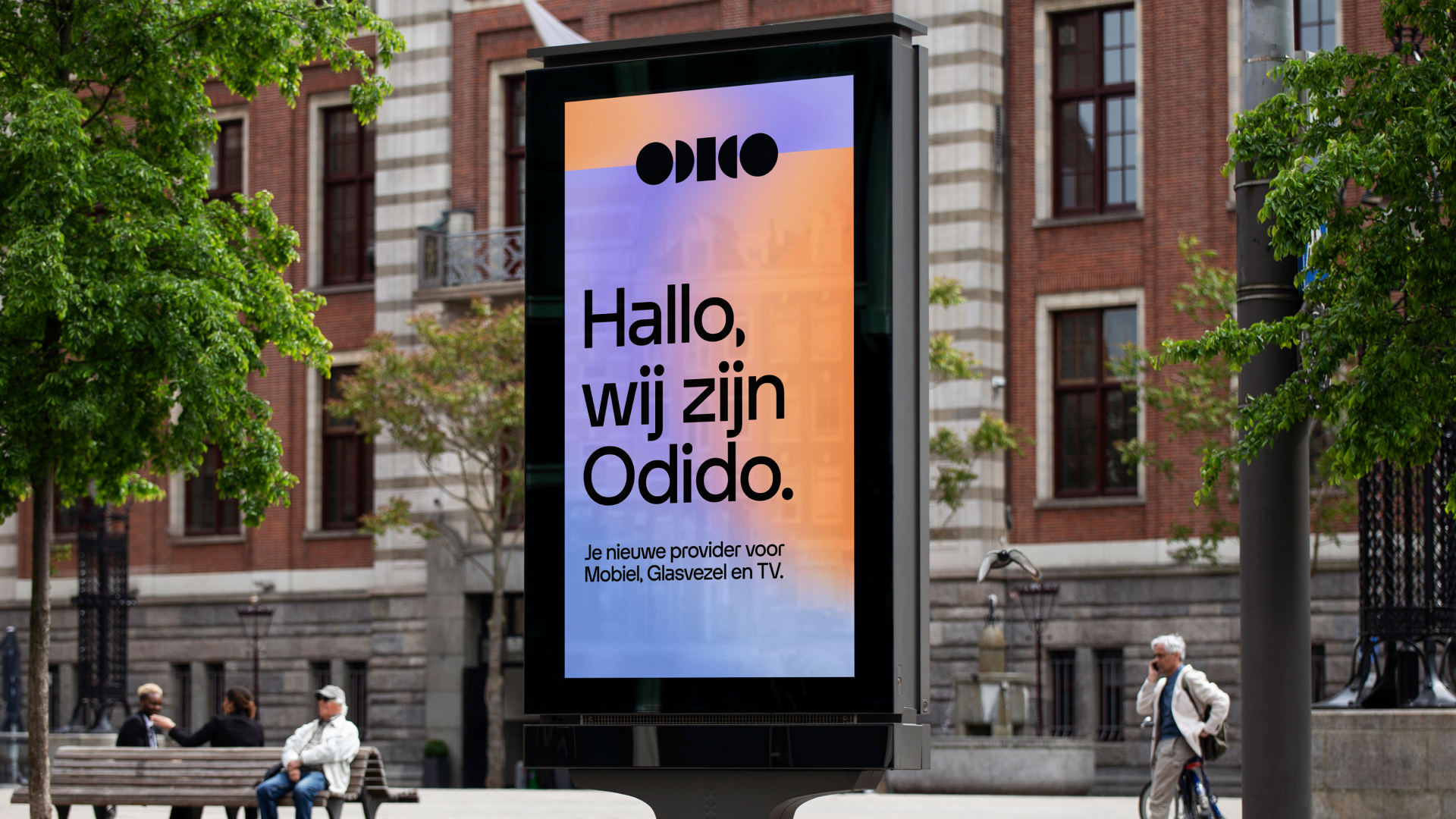
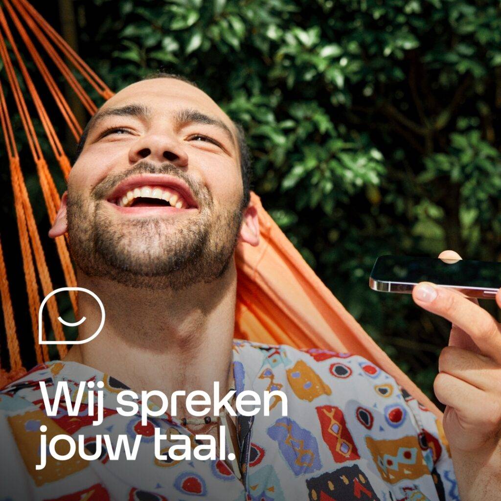
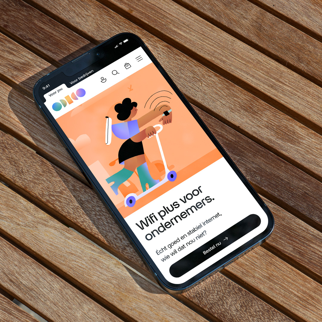
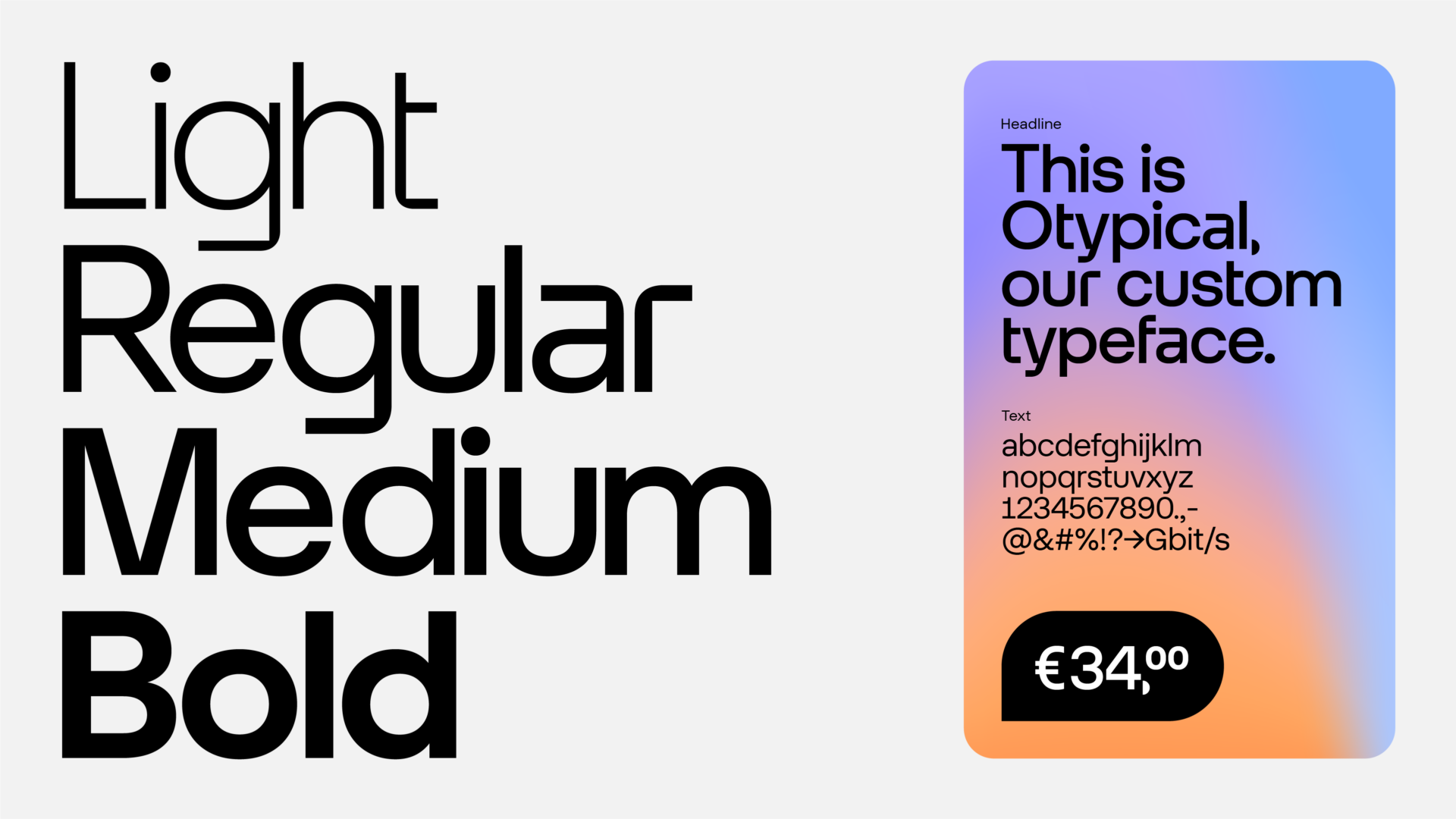
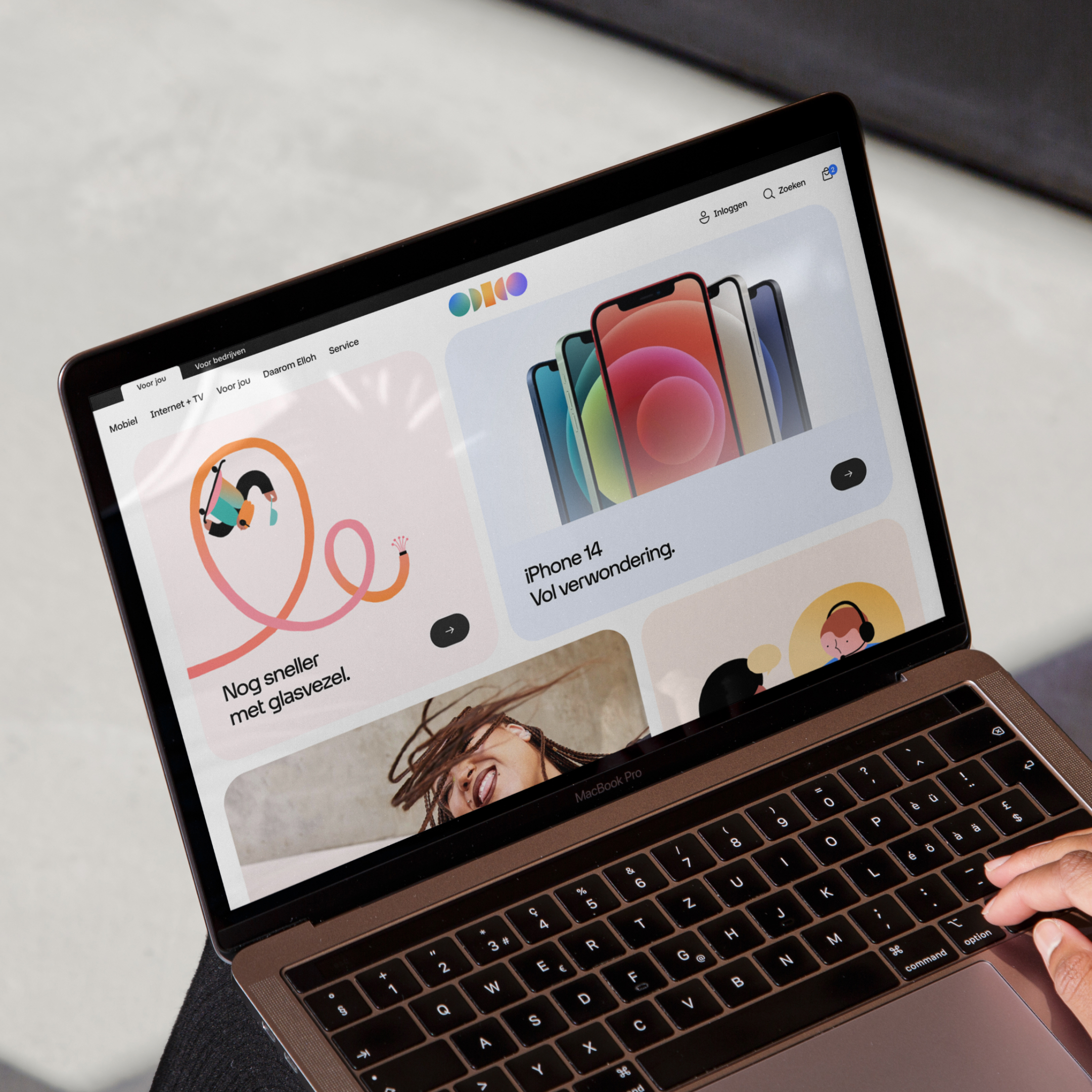
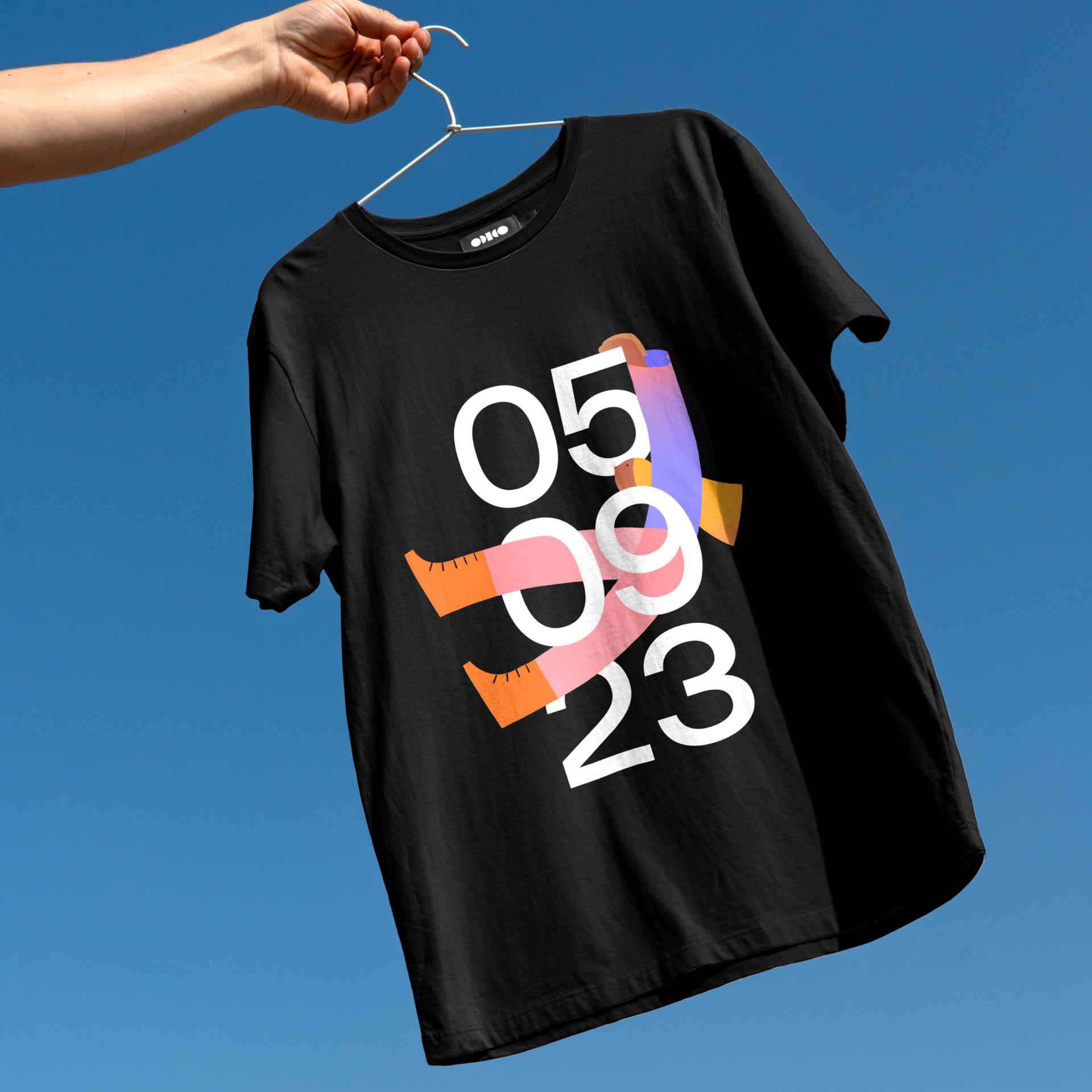
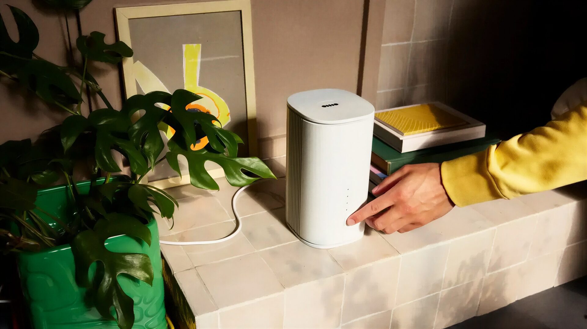
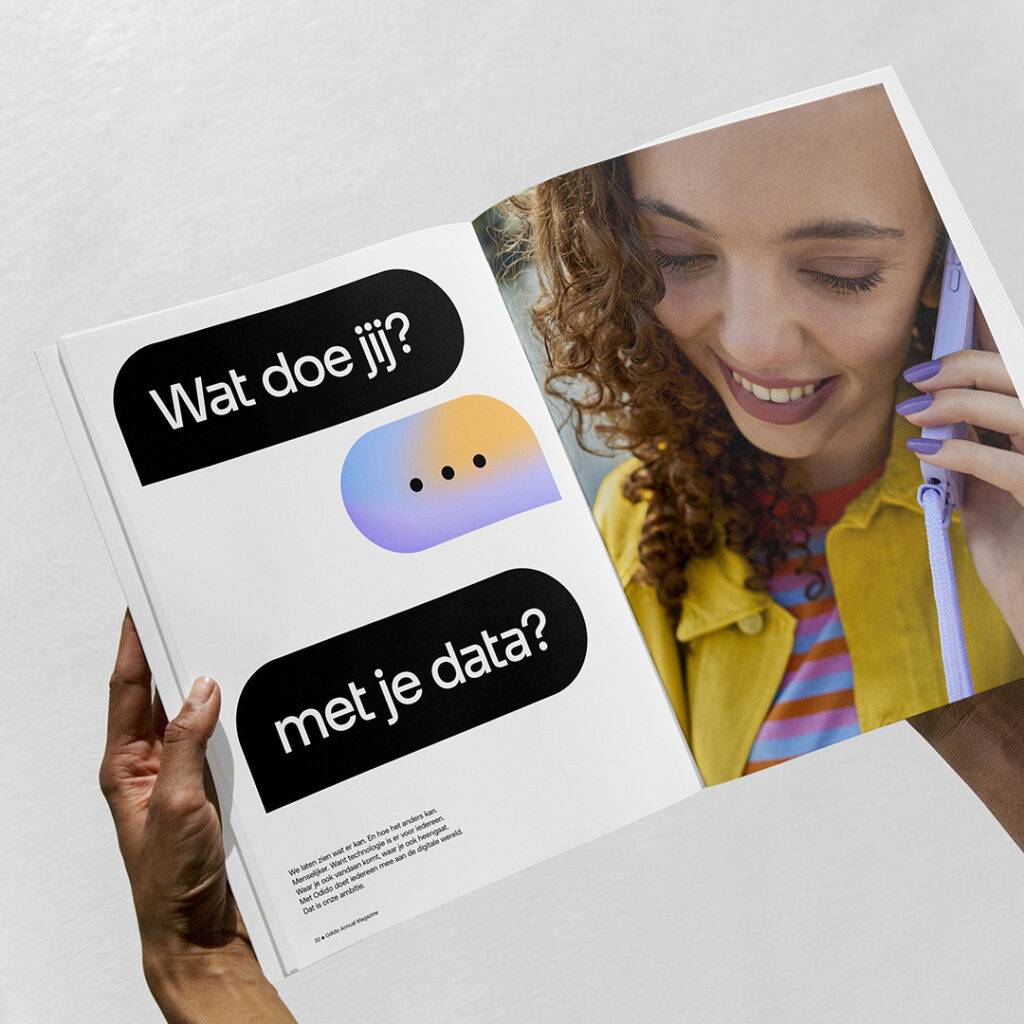
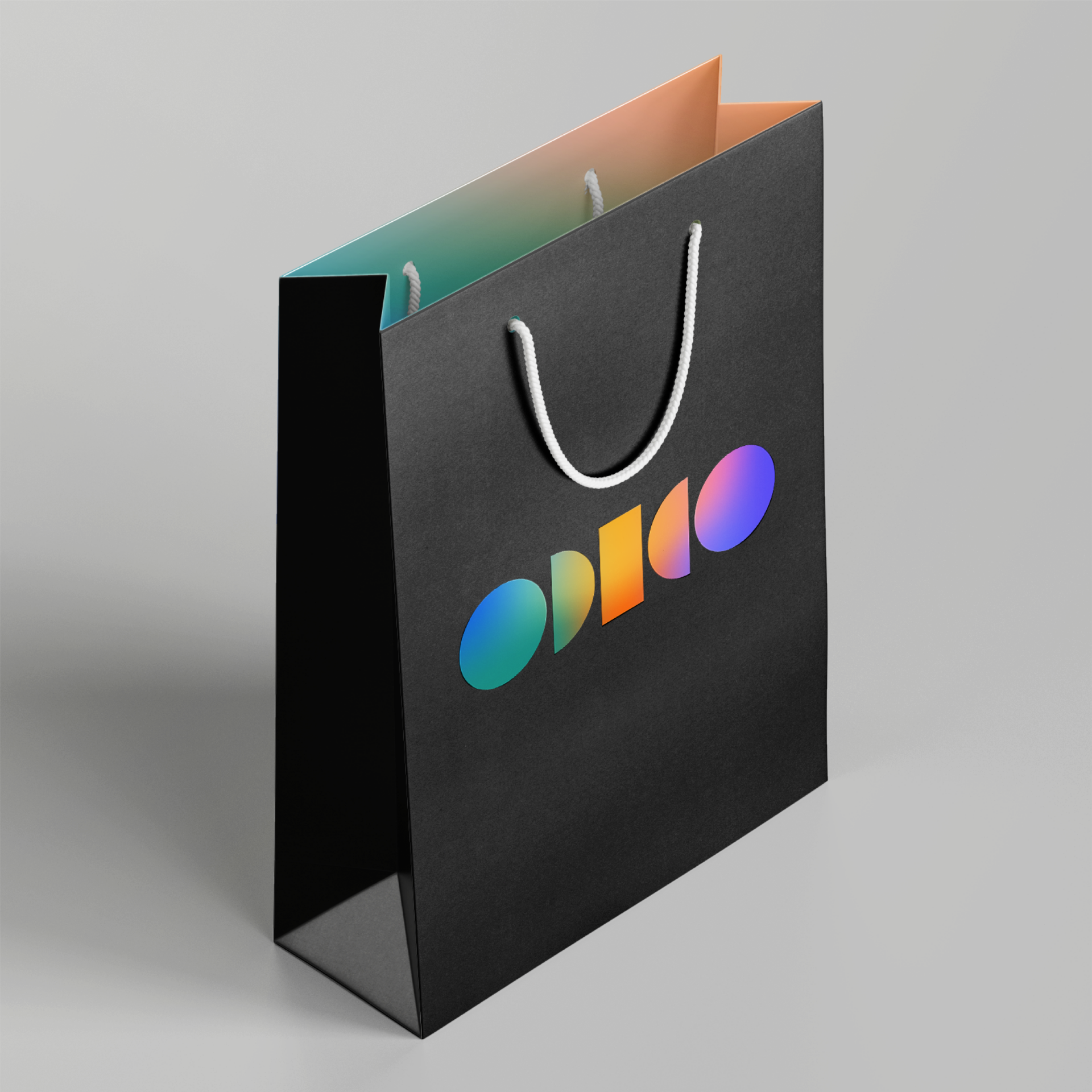
The goal was clear: break away from telco conventions. Instead of owning a single colour, Odido embraces the full spectrum, reflecting its open and inclusive character. Geometric shapes, warm gradients and a mirrored layout system create a distinctive foundation, brought to life through a custom typeface, bold photography and illustration. Across digital and physical touchpoints, the identity gives Odido a playful, human take on technology and the confidence to shake up the market.
Take a look at merk.odido.nl


Results
Aided awareness after only 15 months.
Most valuable brand in The Netherlands.
Seen as forward-thinking and human.
Odido quickly built recognition, preference and brand value. Its human and forward-looking character comes through clearly, showing how a distinctive identity can create both brand and commercial impact.